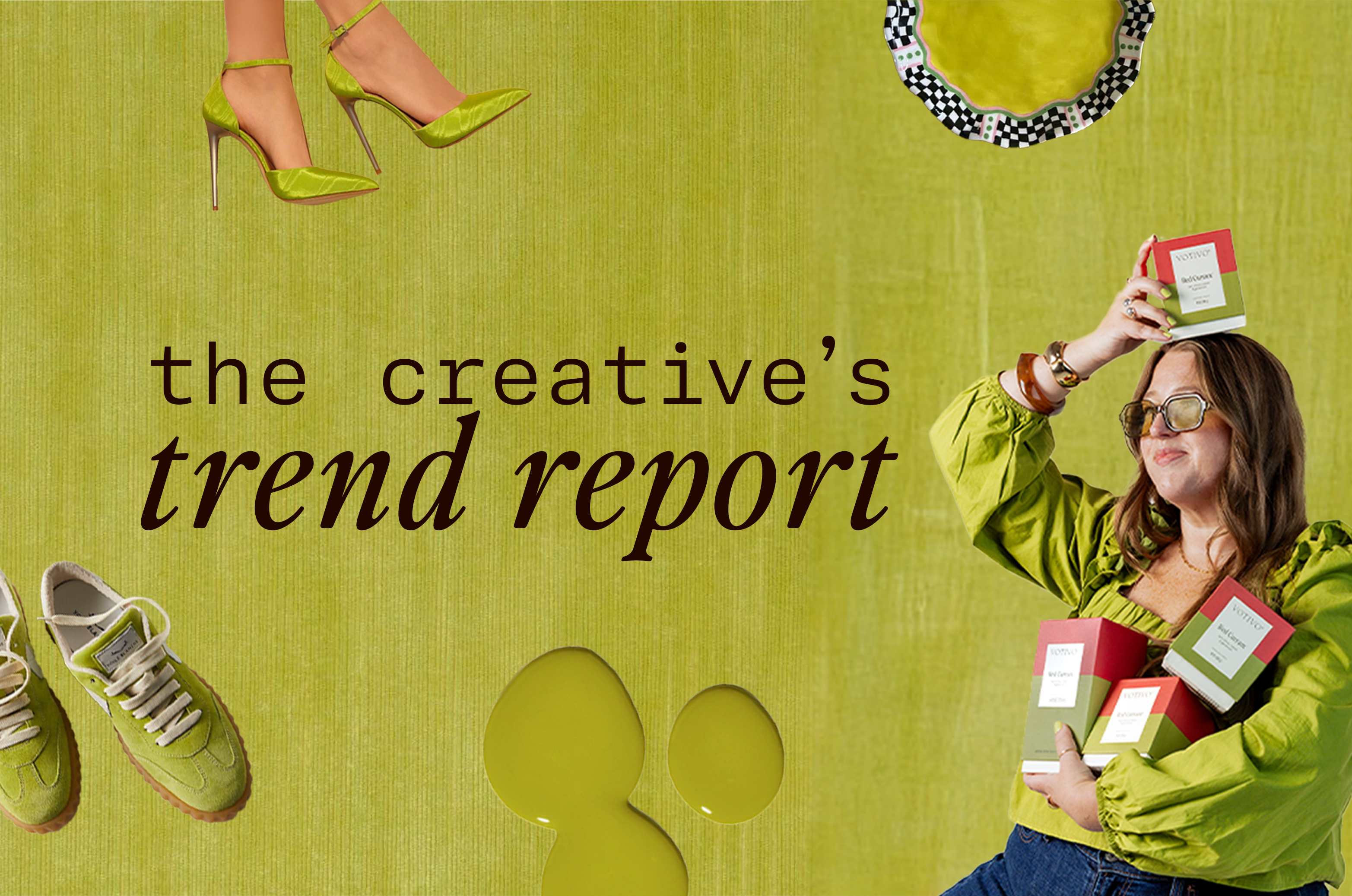
The Creative's Trend Report: Chartreuse
Fall is here, and winter is approaching. While I'm absolutely loving earth tones (specifically chocolate brown) in home and fashion trends, I do recognize the power of an accent color here and there.
I'm currently seeing chartreuse sneaking into home décor, floral design, and apparel, and I'm here for it! I love how citrusy, zingy, and edgy that splash of color can be when paired with warm, muted palettes.
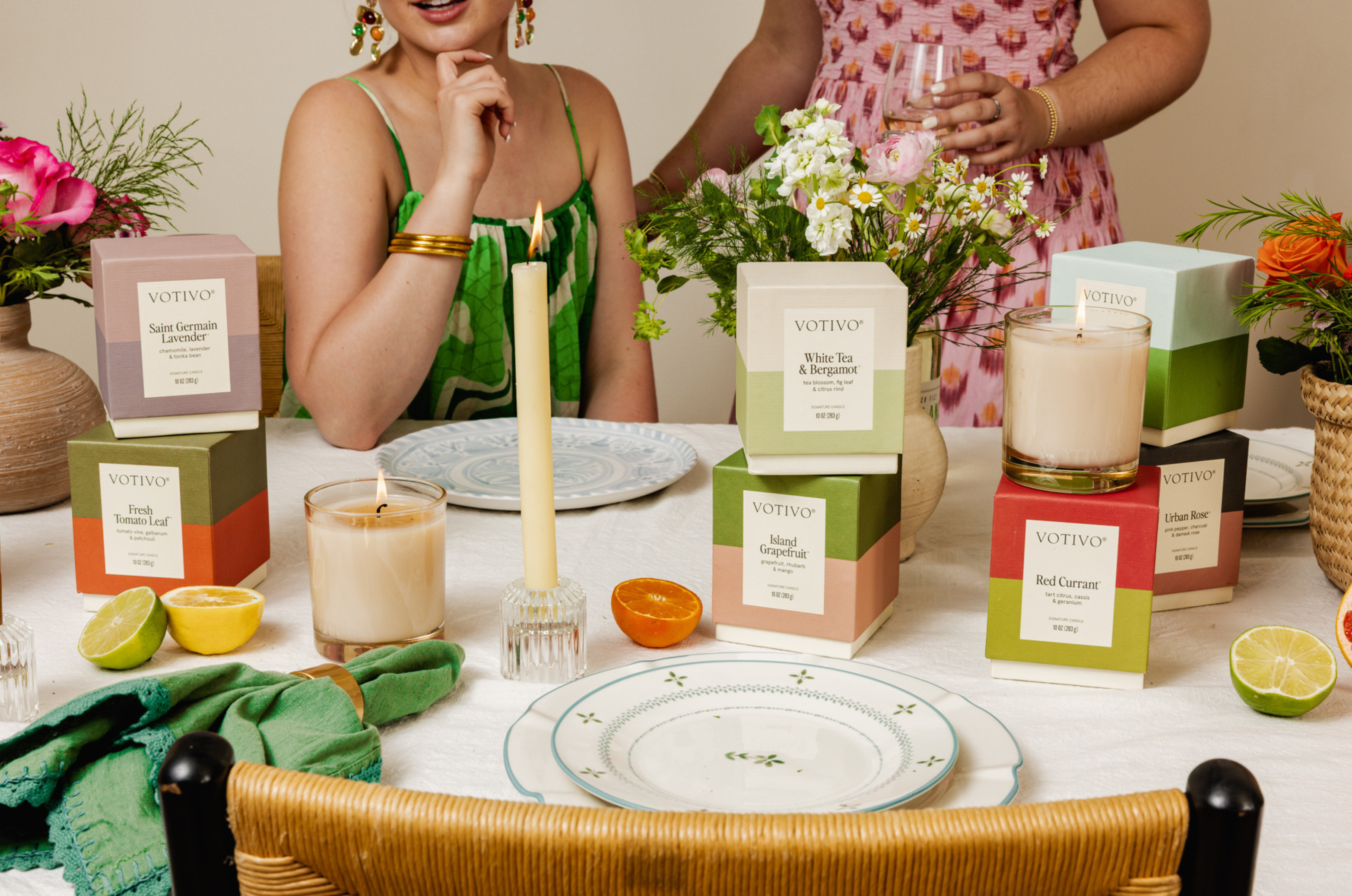
Our best-selling Red Currant uses chartreuse as one of the two colors that make up its duotone packaging. When searching for the perfect green for our new packaging, we looked for something that would capture those garden and citrus notes that make it such a powerhouse of a fragrance—and landed on chartreuse.
If you're craving a zip of brightness in your home or wardrobe, consider adding chartreuse (and burning Red Currant). I promise it will put a little pep in your step.
xoxo,
Lindsay
Creative Manager
Leave a comment
This site is protected by hCaptcha and the hCaptcha Privacy Policy and Terms of Service apply.